

The Covid Vaccination Rollout in Ontario

In my previous post, I pointed out that vaccination against Covid-19 has not only failed to stem the tide of Covid-related hospitalizations and deaths, but has also been accompanied by an increase in those outcomes across the population of Ontario as a whole. We continue to be reassured by our public health officials that unvaccinated individuals are far more likely to get seriously ill or die when compared to the vaccinated, and that everyone should continue to do their part and keep ‘up to date’ on their Covid shots: we’re now up to five (and for some, six) injections in less than two years. But something doesn’t add up, and if the recent trend in vaccine uptake is any indication (source here), the Ontario public is starting to realize this:
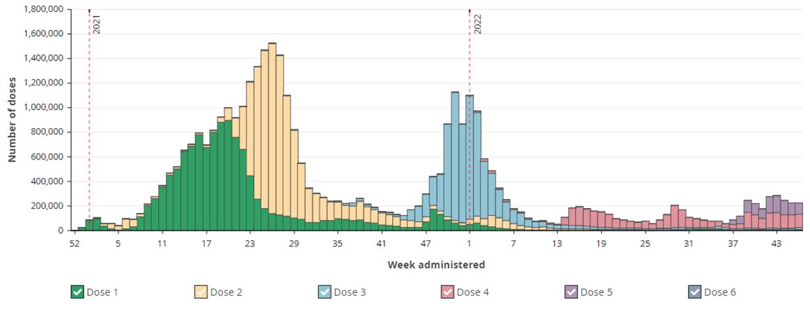
Clearly, with each additional shot, interest has dropped considerably. Week 14 (early April) saw the beginning of wider availability for Dose 4. The purple bars starting in Week 37 (mid September) represent the ‘new and improved’ bivalent vaccines, but it seems highly unlikely that their use will rise even to the level of the 4th dose, which itself was well below that of the 3rd. As of November 20th, after almost seven months of availability, just 23.6% of the eligible population (12+) had received at least two booster shots. A percentage figure for the bivalent doses is not given, but can be calculated from the number of doses (1966240, as of Nov 20th) divided by the total eligible (12+) population (13312725): 14.8%. This figure will certainly rise as we head into the winter season, but it is hard to say if it will even match the level of the second booster. Interest in the new shots peaked during Week 43 and is currently declining. If this scenario continues, it will merely bring to completion a dramatic shift in sentiment over the course of 2022. The number of people aged 12 and older who had completed their primary series (source here) had reached a plateau by early April:

At that time, just 12.5% of the Ontario 12+ population had received less than two injections (most of these had received none); as of Nov 6th, this figure stood at 11.7% and is unlikely to go down much further. While the percentage of those who stay ‘up to date’ with their Covid vaccinations will, at least in the short term, end up being somewhat higher than those have refused to complete their primary series, in less than a year, Ontario citizens have flipped from being mostly compliant with public health Covid recommendations to being mostly uninterested. There seems to have been a significant loss of trust in public health messaging, at least with respect to vaccination against Covid-19.
A full discussion of the possible reasons for this loss of trust is beyond the scope of this post, but one of the main ones, I suspect, is the perception that these vaccines have not lived up to what was promised about them, a perception rooted in personal experience for many. Let’s consider several other data sets that might shed some light on this experience.
As with the excess mortality figures that I considered in my previous post, it is useful to consider evidence that goes beyond the narrow lens of ‘Covid’ hospitalization, which, as we have seen, can have considerable overlap with other conditions. The following chart, taken from the Acute Care Enhanced Surveillance system (source here), does just that, capturing a much wider range of respiratory-related hospital admissions in Ontario since the start of the Covid crisis.
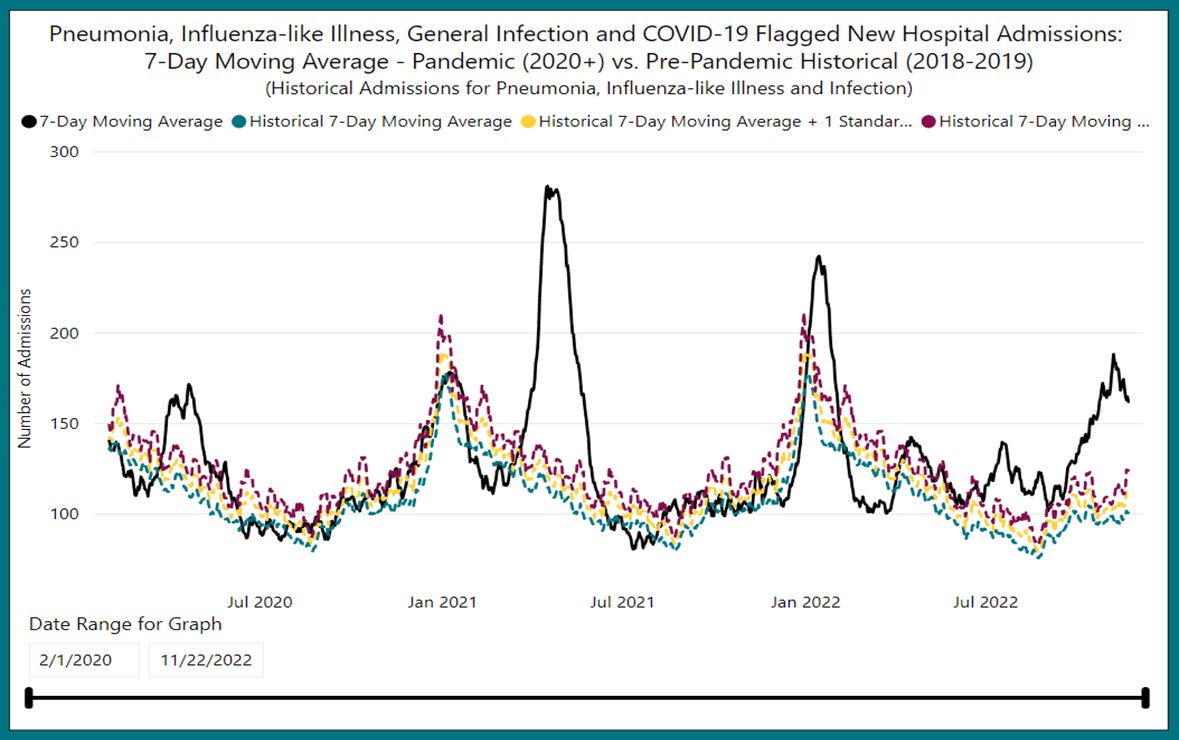
We can see the impact of the first wave of Covid infections in the Spring of 2020, followed by a second wave peaking in January of 2021 which is indistinguishable from the normal winter pattern of respiratory illness. Then something highly unusual happens: a massive surge in hospitalizations that peaks in the third week of April, 2021, the so-called ‘third wave’. I call it unusual not merely because of its large size, but also because its timing corresponds exactly with the ramping-up of the Covid vaccination campaign. I have yet to hear a convincing explanation from any medical authority as to why such a large spike in hospitalizations occurred at that time. It certainly cannot be attributed to the sudden rise of a new SARS2 variant. While it is true that ‘Alpha’ was gaining ground at the time, at its peak in early May it had only reached 58% dominance, unlike the Delta and Omicron waves that followed, each of which went to almost 100% very quickly (source). Nor can a convincing case be made that Alpha was so much more virulent or transmissive that it might lead to such an increase in hospitalizations. If anything the opposite is true: respiratory pathogens usually mutate toward milder forms. [edit: see Brian Mowrey’s brilliant discussion of why this assumption should in fact not be made]
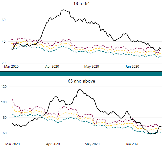
Let’s now restrict our view to the time period from the beginning of the vaccine rollout (late December, 2020) to the present. Here I stack our original ‘vaccine doses administered’ chart over two age bands from the ‘pandemic tracker’ website, followed by excess mortality data (source) from Statistics Canada:
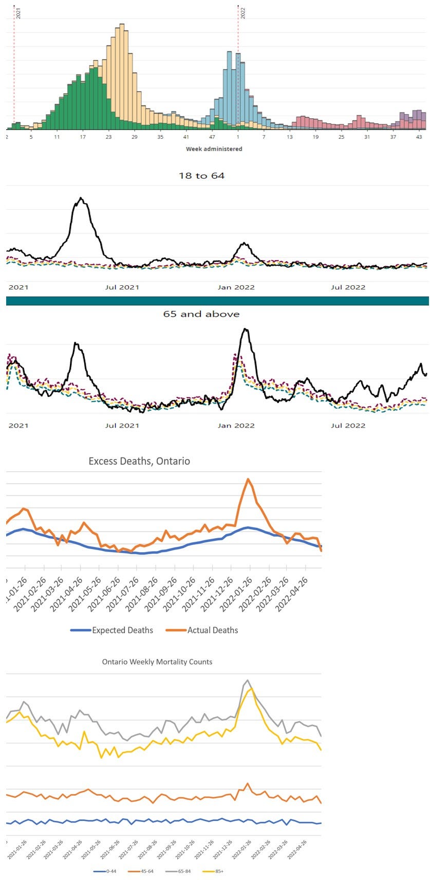
Again, the 18-64 and 65+ age-band charts show all hospital admissions for acute respiratory distress, including Covid. The excess deaths chart reflects all ages combined, but as the last chart shows, most of that excess is in the 65+ demographic (though some minor peaks occur in the 45-64 range as well).
When viewed together, these four data sets present an interesting composite picture and suggest a number of questions. As noted earlier, the huge spike in hospitalizations in April-May of 2021 stands out, but now we can see that this event was even more of a departure from historical norms for younger people (18-64) than it was for older people (65+). Why, with a weaker virus and the arrival of vaccines, would the Wave 3 hospitalization peak be much higher than the original Wave 1 peak? And why was it worse for younger people? As can be seen from the earlier graph showing the entire period, compared to Wave 1, the Wave 3 peak was about twice as high for the 65+ group and three times as high for the 18-64’s. Fortunately, very few of these younger people lost their lives after their hospital stay, as reflected in the relatively flat lines for the two younger age groups in the ‘Ontario Weekly Mortality’ chart. Almost all of the excess death is in the 65+ demographic, as is typical for respiratory illness.
Given the anomalous nature of these ‘third wave’ hospitalizations, which followed a perfectly typical winter respiratory season (typical at least as far as this data is concerned, and keep in mind that this chart includes Covid-labelled events), it would be intellectually dishonest to rule out the possible impact of the start of the mass vaccination campaign, which only really took off in late February. An intriguing feature of the charts for the two age groups is the fact that 65+ group peak is earlier than that of the younger group (April 16th and April 25th, respectively):
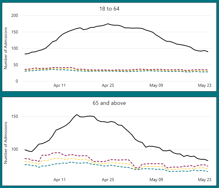
We do not see this pattern of respiratory hospital admissions peaking for 65+ earlier than for 18-64 in any of the other major waves:
Wave 1:
Wave 2:

Wave 5 (Omicron):

Compared to ‘Wave 3’, might we describe these other waves as being more ‘natural’ infection surges, in which all ages are impacted at the same time? Conversely, might ‘Wave 3’ be understood best as an artifact of the first exposure of the population to Covid vaccines? Many observers have wondered about the temporary suppression of the immune system after the first injection. And since that exposure was staggered according to age, could this explain why the older age category peaked a little earlier than the younger? And perhaps the size of the effect is greater in younger people because of their more robust immune systems. I put this scenario forward as a hypothesis. Perhaps someone more knowledgeable can provide a better explanation.
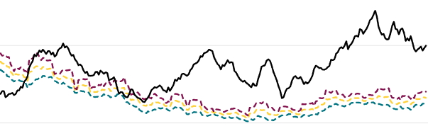
The next major spike in hospitalizations among the 65+ demographic comes with the arrival of the Omicron variant, a surge that peaks in January of 2022. The corresponding spike for 18-64 year-olds is much smaller (though still well above historic norms). Why would this particular peak be relatively higher for older people compared to the Wave 3 peak, but relatively smaller for younger people? Part of the answer is the fact that the first Omicron peak happens during the normal winter maximum, when older people are always more susceptible to respiratory complications. But could it also be partly a result of the fact that fewer younger people were taking the first booster, which was being rolled out at the time? This is another hypothesis that would be hard to prove definitively, but the data are suggestive.
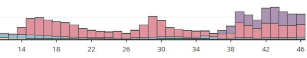
Some support for this hypothesis might be seen in the fact that after the January 2022 Omicron surge, respiratory hospital admissions remain close to normal levels among the 18-64s (though a small increase can be seen at times). This stands in stark contrast to the series of distinct ‘humps’ in the data for the 65+ demographic since late March. Of course, it has been this 65+ demographic that has been receiving most of the ‘second boosters’ and ‘bivalent’ shots, which, if these charts are any indication, haven’t provided much benefit. In addition, note the almost exact correlation between the three recent ‘bumps’ in dose 4 and 5 administration and both the three mini-surges of respiratory hospital admissions among those aged 65 and older and the number of outbreaks in institutional settings:
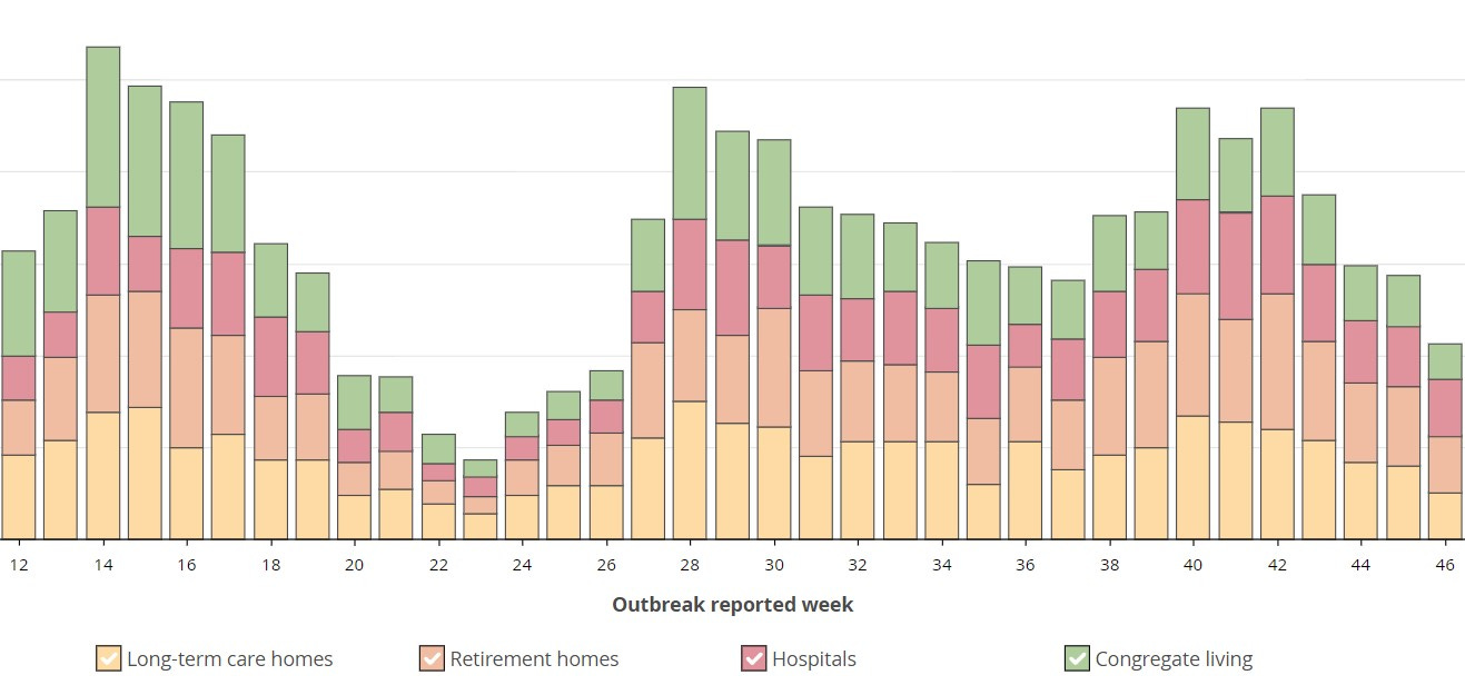
I hesitate to attribute any causality here, but the correspondence is uncanny. Quite apart from any link between the two data sets, however, we should ask why the lower two are so erratic. What has been happening among older people that would produce such an effect? And can we really say that their frequent vaccinations against Covid have been a net benefit to them? The overall picture of institutional outbreaks (source here) is rather sobering:
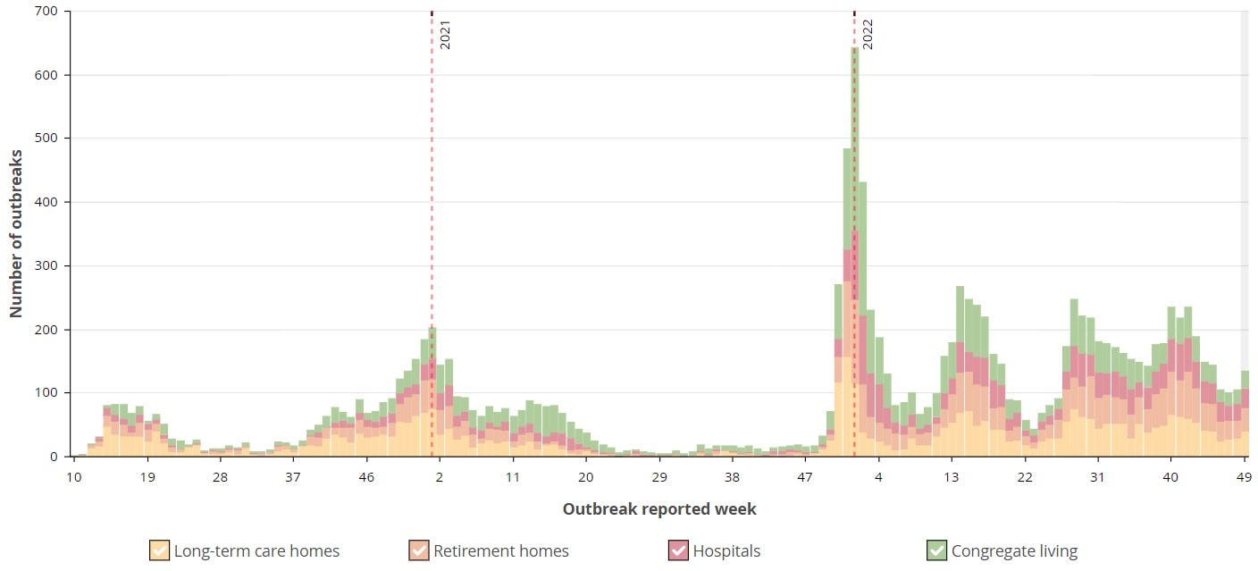
It would appear that all of the strategies to protect the institutionalized vulnerable over almost three years have only served to make the problem more acute. Of course, one can always trot out the fall-back position that ‘it would have been much worse’ without such interventions. Perhaps. But it’s hard to see how this might be shown. Such a position seems more like a desperate attempt to support a set of policies that have in fact failed. At the very least, the constant boosting of the elderly doesn’t seem to be doing much to prevent a ‘new normal’ of rolling lockdowns in care homes from continuing for the foreseeable future.
With every new shot past the ‘primary series’ (i.e. the first two), the Covid vaccination program in Ontario has seen a significant drop in demand, despite the fact that the official messaging of Public Health is that everyone should stay ‘up to date’. I strongly suspect that real-world experience with these injections has been a major factor shaping this trend. Behind the elevated respiratory hospital admissions and excess death statistics is a much larger pool of ordinary infections as the SARS-2 virus has made its way around the population, regardless of vaccination status. What was promised has not been delivered.