
The Big Picture

After nearly three years of Covid-related issues dominating our public and private lives, deep divisions remain unacknowledged and unaddressed. A significant minority of Canadians, numbering in the millions, have been critical of various aspects of government Covid policy since the Spring of 2020, when the current crisis began. Many of these dissidents have also declined vaccination against Covid, earning them the perjorative ‘anti-vaxxer’ label. A much larger segment of the population has been more than willing to follow the rules imposed on them, motivated by the noble aims of minimizing the impact of the SARS-2 virus and protecting our health care systems. And in between these two groups is a fuzzy middle: those who may suspect that not all the rules are sound but have chosen to comply with them in order to minimize the disturbance to their lives.
Is it time for all of us to simply move on?
Let me lay my cards on the table. I am one of those ‘dissidents’ mentioned above. The purpose of the analysis in this series of posts is to invite the reader, especially anyone who has placed their full trust in Public Health authorities over the last two and a half years, to reflect on where the ’war on Covid’ has taken us and to consider whether or not it should be considered a success. This process of evaluation is crucial, in my view. Many assumptions and practices have been normalized which lack any solid grounding in either evidence or ethical reflection. I am convinced that the overall response to this pathogen has been reckless in the extreme, but would be happy to be proven wrong by a persuasive counter-argument. I will be using Ontario data in this post, but the same trends are evident on a national scale.
Let us begin with the now familiar epidemiological ‘curves’ charting Covid hospitalizations and deaths. I leave ‘cases’ to one side since I want to focus on severe outcomes, which is where we should see a difference if our policies have been successful. Even so, there are well-known problems with using these metrics. We have learned that it is important to distinguish between those who have been hospitalized and/or died ‘from Covid’ (i.e. directly or significantly due to an infection from the SARS2 virus) and those whose severe outcome is merely accompanied by a postive PCR test (‘with Covid’). It has always been the case that severe outcomes due to this virus, in any of its variants, have been strongly skewed toward the elderly, who tend to have multiple health conditions that make them more susceptible, along with generally weaker immune systems. There are also significant issues related to the PCR test itself, issues that were raised soon after the crisis began and which have yet to be acknowledged by any government or medical institution. For our purposes here, we can leave these issues to one side and evaluate provincial outcomes by using the government’s own published data, which presumably has been curated in the same way throughout the Covid response. The aim is to assess trends over time, i.e., to see how the ‘war’ has been going.
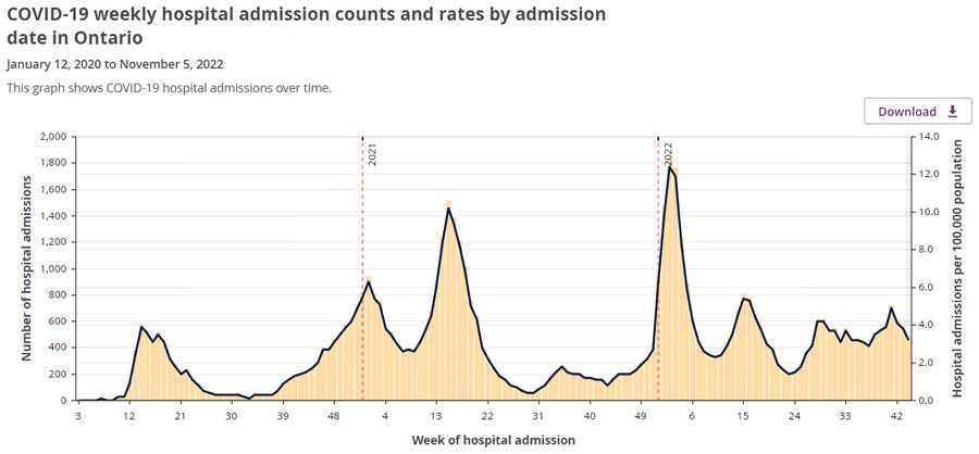
Looking at the above graph (source here), it is difficult to make the case that our efforts to reduce hospitalizations due to Covid have had much of an effect. In fact the opposite seems to be the case. 2022 has seen more hospitalizations to date than all of 2021.
Much the same can be said for the data on Covid deaths, shown below. Of particular note is the fact that the low point in the seasonal cycle of Covid respiratory deaths went almost to zero in 2020, but then increased in each of the following two years. This suggests that the Ontario population has actually become progressively less resilient to Covid over time, which doesn’t speak well of the efforts of Public Health to protect the population.

Recall that the Covid vaccination program began at the end of 2020. It was sold to the public as the only guaranteed way to end the pandemic. When this failed to happen, the messaging shifted to the claim that vaccination would protect against severe outcomes. But judging from the two graphs I’ve just given, this, too, has failed to materialize. In late 2022, the same vulnerable people are getting sick, being hospitalized, and dying with Covid as they were in the Spring of 2020. The only difference is that now the vast majority of these people have been vaccinated, and many of them have been boosted as well.
I hope to return to the impact of the vaccination program in a future post. For the time being, let’s consider another way of looking at health outcomes across the population since March 2020: all-cause mortality. One major advantage of this metric is that it is more objective than the category of ‘Covid deaths’, since it doesn‘t require any judgement call as to the cause of death. Another advantage, reflected in the label itself, is that it captures the mortality burden from all sources. If the overall level of mortality shifts outside of the expected range, one can then attempt to relate this change to any major change(s) in policy or circumstance that might have produced it.
The charts below display the number of deaths recorded annually in Ontario from 2010 to 2022, in four different age categories. The data is drawn from Statistics Canada (source here). In each graph, ‘Series 1’ (blue) represents the pre-Covid baseline trend in mortality, while ‘Series 2’ (orange) represents the Covid era. In order to make the maximal use of the available statistics, and to demarcate the Covid era from what preceded it, the charts compare exact 52 week periods stretching from March of one year to March of the next. (Since a year is slightly more than 52 weeks, the latter data points regress slightly, with the final week of data dipping into late February, but this does not materially affect the overall picture.) Thus the blue dot above 2019 represents the period from early March of 2019 to early March of 2020. Likewise, the first orange dot, above 2020, represents the total number of deaths from early March of 2020 to early March of 2021, and so on. The blue line is a trendline projecting the mortality figures of the baseline into the future. This allows us to compare what actually happened (orange dots) with what we might have expected if events related to Covid had not occurred. I’m making the assumption that, for the post-March 2020 period, no other major disruptions to public health need to be taken into consideration besides the impact of Covid itself and the the impact (both positive and negative) of the range of policies introduced to deal with it. As noted on the Statistics Canada website, predicting mortality trends (and thus excess mortality compared to a baseline) is not an exact science. There are a variety of ways to calculate excess mortality and the results will vary depending on which formulas are used. Keep in mind, however, that the dots in these charts capture raw mortality data, i.e. actual deaths for the period in question. Even without any trendline, it is obvious that something quite dramatic began to occur in March of 2020. Ideally, this data would be broken down into much smaller age-bands (5 or 10 years each) so that we could see which groups have been dying at a higher rate since March of 2020, but we have to work with the data that Statistics Canada is willing to provide.

What is striking about this particular graph is that people in this age range (0-44) have been only minimally affected by Covid itself. According to the Government of Ontario’s Covid-19 dashboard, as of March 16, 2022, a cumulative total of 140 Covid deaths in the 0-39 age bracket had occurred since January of 2020, while 211 deaths had occurred in the 40-49 age range. Since deaths are very strongly age-related, the 40-44 range is likely to represent less than half of the 40-49 range. A reasonable guess at the deaths in the 0-44 range (to match the Statistics Canada data that we’re working with) is thus around 220. An exact figure is not needed, however, to see that very large discrepancy between the impact of the virus on people in this demographic and the overall outcomes that they experienced. Comparing the trendline to the orange dots in the chart yields approximately 2200 excess deaths from March of 2020 to March of 2022, but only about 1 in 10 of these deaths (i.e. the 220 or so that we just calculated) were related to Covid in some way. This suggests that, in Ontario, around 2000 young or relatively young people died beyond what was expected in that time period not because they were infected with the SAR-2 virus but due to other causes. It is reasonable to assume that these other causes are related to the unintended consequences of the full range of policies adopted to mitigate the impact of the virus itself.
Let’s now see how things look in the older age groups.

Using the same approach as above, we arrive at a figure of around 2700 excess deaths in the 45-64 age bracket between March of 2020 and March of 2022. And once again we need to estimate the Government of Ontario figures for this age category since it doesn’t match the age bracket used in the national data. There are 131 deaths remaining of the 211 from the 40-49 category, plus 669 in the 50-59 category. That leaves 1498 in the 60-69 bracket to be, once again, divided unevenly due to the steep age gradient for Covid deaths. Using the same ratio as before, I will assume that around 540 of these deaths are in the 60-64 range. This brings us to a total of approximately 1340 Covid deaths in Ontario in the 45-64 age category, as of March 16, 2022. And once again we see a discrepancy between total excess deaths and Covid deaths. An estimated 1360 more people than expected in the 45-64 age group had died from causes other than Covid infection up to that date.

Following the same procedure as before, here we have approximately 8900 excess deaths among those aged 65-84, from March of 2020 to March of 2022. Of these, approximately 5200 have been ascribed to Covid, leaving 3700 or so non-Covid deaths above the expected value.

Unlike the previous three graphs, when considering the 85+ demographic, it is difficult to say whether or not there has been any excess death since March of 2020. The 2020-2021 period ends up about 2000 deaths above the trendline, but this is not too far off the deviations we see between 2013 and 2016, and the most recent period (2021-2022) has returned to the expected value almost exactly. Meanwhile, according to Government of Ontario data, around 5600 persons aged 85 or more had died due to Covid as of March 16, 2022. It is difficult to avoid the conclusion that almost all of these ‘Covid deaths’ among the 85+ population would have happened anyway as a result of the comorbidities that typically affect the very old. This is in keeping with the fact that the average age of a Covid death in most countries is in the low to mid 80s.
In summary, we find that over the first two years of the Covid crisis, up to mid-March of 2022, around 7000 Ontario citizens lost their lives due to causes that cannot be attributed to Covid infection, causes which, presumably, would not have come into play if the normal trend in mortality had continued past March of 2020. Over that same period there was, as noted above, a total of 12287 official ‘Covid deaths’ according to government sources. However, since the 5600 deaths occurring in the 85+ category do not diverge much from the trendline, it makes sense to subtract them from the total number of ‘Covid deaths’. A surprising result emerges. Even if we allow for some genuine excess mortality among the 85+ demographic (perhaps the 2021-2022 period is a little high?), the adjusted total of genuine Covid excess mortality ends up being about the same as the figure for non-Covid excess mortality: 7000. Another striking observation from the excess mortality data we’ve reviewed is that, apart from the very oldest demographic, the picture is significantly worse in the second year of the crisis, when almost everyone had been vaccinated, compared to the first, when almost no one had been vaccinated.
Enough has now been presented to provide a reasonably accurate view of the progress of the ‘war on Covid’. I have drawn entirely on government data and have, I hope, avoided unwarranted speculation.
A number of questions need to be asked in the light of this data, including: Was there any way of avoiding non-Covid excess death? Did the policies enacted to prevent Covid deaths make much of a difference, and how would we know this? Was there a net mortality benefit to the mass vaccination campaign? What does the picture look like when all causes of death for the period in question are taken into account? Was our sharp focus on Covid as a threat to individual and public health disproportionate? These are just some of the questions that critics have been posing in response to the policies that have informed the official government response to the SARS-2 virus. As difficult as the process may be, coming to terms with what actually happened, and in particular with the role of human decisions in shaping various outcomes, is essential if we want to improve our ability to minimize the overall health burden of infectious respiratory disease in the future.
Hoping this will open the door to an honnest discussion on the matter. Great work.