

Excess Mortality in Canada: Part 2

In my last post, I explored Canada's national excess mortality over the first three years of the Covid response (early March of 2020 to late February of 2023). I did so by comparing the ten 52-week periods before March of 2020 to the three following it. This allowed us to see the full mortality effect of all of the changes to society that appeared once the War on Covid got underway. The data are sobering. For most of the population, the third year of the Covid response was worse than the previous two, and for the rest of the population (with the possible exception of the very old, i.e. 85+) mortality remained well above what was expected. My estimate of total excess mortality for the 156 weeks (3X52) under consideration was 69900 (adding all the values in red from the graphs). I also noted that unclassified deaths rose from a baseline of about 5000 per year (March to March) before 2020 to almost 18000 by March of 2023.
After reading an excellent write-up of Irish excess mortality by Witzbold, and his translation of a fellow analyst's take on the German situation, I wondered about checking my results by focusing on mortality rates instead of numbers of deaths to establish trendlines. One advantage of this approach is that it allows us to identify patterns in a more age-specific manner (5-year brackets, except for 1-4 and 90+) instead of the broad categories I used previously. The data can be found here. The mortality rates given are for calendar years, so some adjustment must be made in order to compare any result with my 'Covid-response years'. As before, I used a ten year period as a baseline and eyeballed the deviations from trend. Once the increase (or decrease) of rate was determined visually, I consulted the Statistics Canada Age Pyramid (here) and calculated total excess mortality for each year and age group, which again ends up as a number in red on each graph:


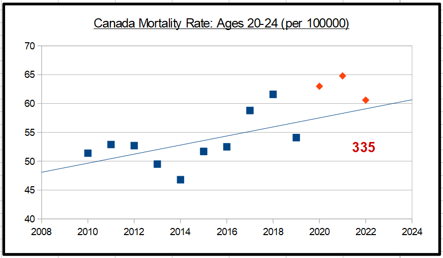


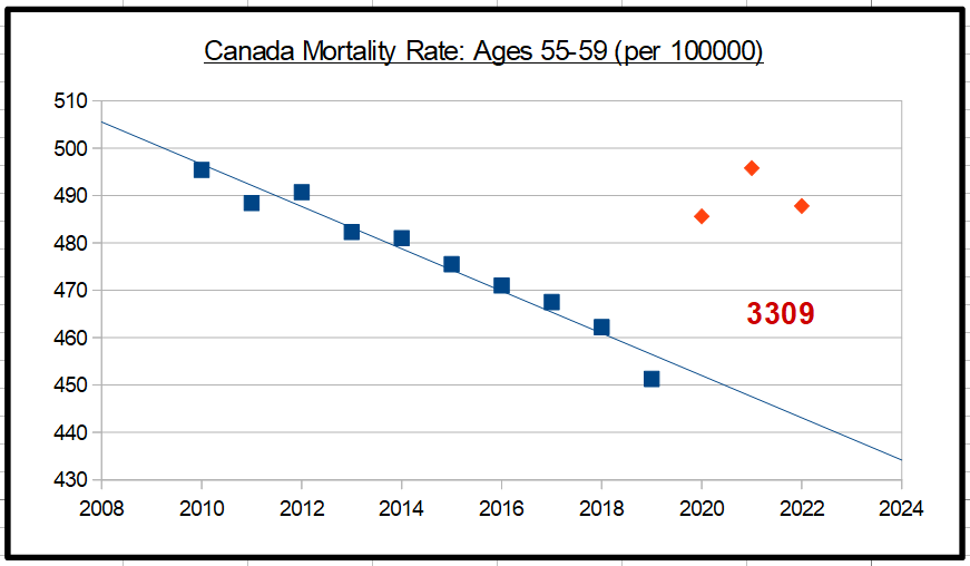


There is much to take note of in these graphs. The broad trends are similar to what we saw in my previous post. Every age category saw increases in excess mortality across one or more years of the Covid response. With the exception of individuals in their 20’s, the third year of the Covid response (2022) saw every age group in Canada at higher rates of excess mortality than at any point in the ten year baseline, and in most cases higher even than the two previous years of Covid interventions (2020 and 2021). Note that this statement is about excess mortality rates, not absolute numbers (which trend down for many age groups). Another notable pattern is that in the youngest three age groups (1-14 year olds) there is a sudden jump in the excess mortality rate in 2022 after a very normal 2020 and 2021. The absolute number of excess deaths here is very small (~150) and easily gets lost among much larger figures among the middle-aged and elderly, but the dramatic surge in 2022 is very clear and deserves an explanation. The three-year pattern for 15-19 year olds is slightly different, with an almost normal 2020 followed by two years of elevated mortality rates (the trendline fit here is poor so I hesitate to claim much accuracy in the excess death figure on this graph). For all ages between 20 and 59 (with the exception of 45-49), 2021 was the worst year of the three, though as noted above, for all except the twenty-somethings 2022 levels were still far above baseline. Strikingly, among 60-79 year-olds, excess mortality rates went dramatically up for three years in a row. This is not an outcome that we would expect after the rollout of a miraculously safe and effective set of vaccines. In the three oldest age groups (80+), there seems to have been a ‘pull-forward effect’ in 2020 which made 2021 mortality rates end up at or near normal since fewer of the vulnerable remained. It is all the more striking, then, to see levels of excess mortality in these age groups surge to very high levels in 2022. Again, what we’re seeing here seems hardly to be compatible with the view that a highly protective vaccine is working its magic.
How do the absolute numbers in this set of graphs compare with my previous estimates? Adding up the numbers in red we get a figure of 54890, about 15000 less than the 69900 derived from my earlier graphs. Why the discrepancy? Part of it is that the lower figure represents calendar years rather than my ‘Covid response years’. We would have to remove January and February of 2020 from the lower figure and add the same months from 2023 to create a better comparison. Weekly excess mortality estimates are available in this table from Statistics Canada. After making the adjustment, about 5700 extra excess deaths can be added to the 54890 figure, for a rounded total of 60600, still over 9000 less than my earlier figure. Clearly, much depends on how trendlines are established, especially when larger age categories are used (as in my first attempt). It makes sense to consider the results from the more fine-grain data (i.e. the lower figure) to be more accurate. There’s a problem with this view, however: Statistics Canada’s own estimated excess mortality for the first three ‘Covid response years’ is considerably higher than my own! All that needs to be done to generate this number is to add up the weekly totals from early March of 2020 to late February of 2023 (156 weeks) as given in the table just cited. The result is an astonishing 86914! There’s a footnote to this table which states the following:
“The quality of the weekly adjusted counts is largely contingent on the level of completeness of the data, that is, the extent to which all deaths have been reported to Statistics Canada. For this reason, only estimates for weeks where the level of completeness reaches 75% or more are shown. This threshold offers a compromise between the robustness and the timeliness of estimates. The level of completeness reaches 90% or more for almost all weeks, with a few exceptions. Although useful to signal potential new recent trends in regard to excess mortality, estimates based on weekly data with lower level of completeness should be used with caution as they were found to carry more uncertainty and be more sensitive to model assumptions (such as the choice of the reference period). Consequently, these estimates are subject to change noticeably in subsequent releases as the number of reported deaths increase for these weeks.”
The latest release has data into August of 2023, while I’ve only gone up to February, so it seems unlikely that lag is an issue. Furthermore, we are assured that the data as published is virtually complete (“90% or more”) in almost all cases.
I’m left wondering why the two other methods of estimating excess deaths that I used produced such different results. But to pursue clarity here would be to miss the main point. Whether the real level of excess death is a little over 60K, or around 70K, or almost 87K, these are huge numbers that cannot, by any stretch of the imagination, be attributed solely to the SARS2 virus or its after-effects. In fact, given the very loose way in which ‘Covid deaths’ have been identified, I would be surprised if the ever-evolving virus accounted for even a third of them. Of far greater concern has been the reckless (and completely failed) mission to control said virus at all costs. Those costs have been staggering, and are only partially reflected in the dry statistics that I’ve been reviewing here.